
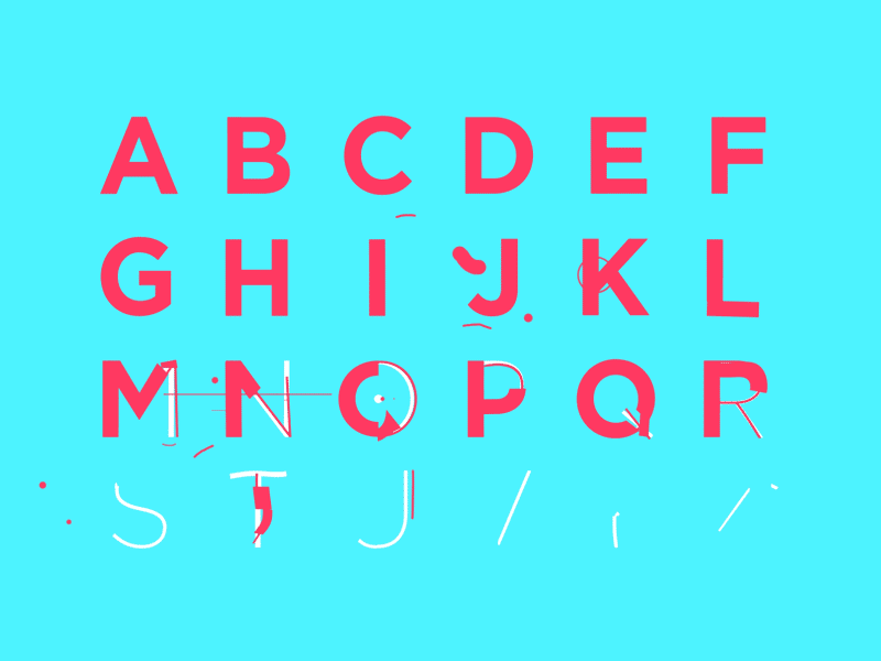
Typography isn’t just about letters being legible and easily understood, sometimes they are shapes with depth and interest. GIF from gifvideo.net
What is typography?
Not to be confused with mapmaking, that’s cartography. Typography “is both an art and a technique. Once created through printed materials (remember Johannes Gutenberg’s printing press?), typography is all about arranging type (letters or characters) in a way that enables learning and recognition.” Typography explores type as letters for reading such as paragraph or body text as well as headlines and bylines. An additional field in the world of type includes type as image. Type can not only be understood in explicit terms but can also evoke emotions and be its own art form. Let’s go over a few terms and tricks to help you communicate better with a designer on your next project (or impress your friends at a dinner party!)
Typefaces vs. Fonts
Most people understand “fonts” as a catch-all term for text. We even have our favorite fonts, mine is Bebas Neue, (it works with just about any subject matter, it is the basis of the Netflix logo.) A font is a particular instance of a typeface (Helvetica light, bold or Arial italic or black.) In contrast, a typeface is a larger family of related letterforms (Helvetica, or Arial) and is often called “type.” As an article by FastCo explains, “The difference between a font and a typeface is the same as that between songs and an album. The former makes up the latter.”
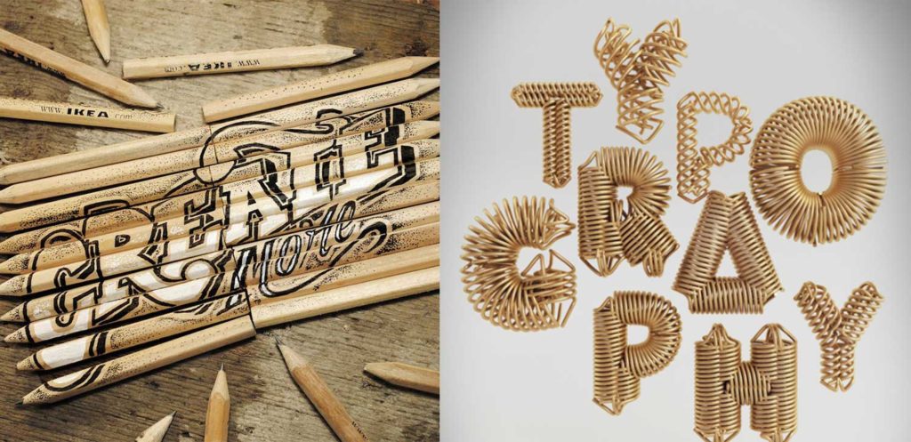
Image references: left and right.
Serif and sans serif fonts
An integral part of design is knowing which typeface is appropriate for the subject matter. For example, serif typefaces are often used for large blocks of text because our brains can recognize the letterforms and make reading easier. Serif typefaces also do not strain the eyes when read in a printed format. Sans serif typefaces are often used for short lines of text and headlines, they are usually bold and meant to attract attention.
So, what’s the difference?
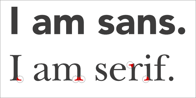
Serif typefaces have actual “serifs” or strokes that extend past the edges of their letters. They are often called “feet.” This is associated with a more outdated form of writing that showed where a pen started a stroke or trailed off. Serif typefaces are often used in traditional business logos like law firms, high-end fashion brands and banks.
Sans serif typefaces do not have serifs and are often bolder or more elongated than serifs. As you may have noticed, they are much more common in the world of design today. The wide use of sans serif typefaces came about during the advent of the internet. They are typically easier to read on the web.
If you or a member or your team, would like to read more, here are a few resources:
How to Pick the Perfect Font for Your Design Project
https://blog.hubspot.com/agency/pick-font-infographic
More in-depth information (including tracking, hierarchy and the parts of a letterform)
https://blog.hubspot.com/agency/typography-introduction
Typography principles for non-designers
https://www.tagteamdesign.com/5-web-typography-principles-for-non-designers/
A comprehensive, in-depth guide to typography for beginners
https://www.manmadediy.com/users/joelselby/posts/4829-a-primer-on-typography-for-non-designers
Quick Tips:
- Limit the number of fonts you use for a flyer or other designed material. Two or three is ideal or even better use one typeface and use multiple fonts (see what I did there?).
- Find online inspiration for your projects, try: http://beautifultype.net/, https://fontsinuse.com/, https://typostrate.com/typography-inspirations/.
- Keep it simple! The more elements that are on the page, the harder it will be for your reader to understand the message.
- Don’t be afraid of scale – It can make your designs look dynamic and add emphasis where you want it.
- No comic sans, ever! If you are trying to convey a fun and casual look to Babiole, Nora, and Albus & Friends.
For visual examples of tips and more help: Medium.com

Author, Laura V. Boston
The C3 Group